Phorum
-
Utah Mammoth: Name & Brand Revealed
Utah Mammoth: Name & Brand Revealed
The newest NHL team now has a name and brand identity! Check it out. Fun fact — there are Wilsonart surfaces in the Utah arena locker rooms!

-
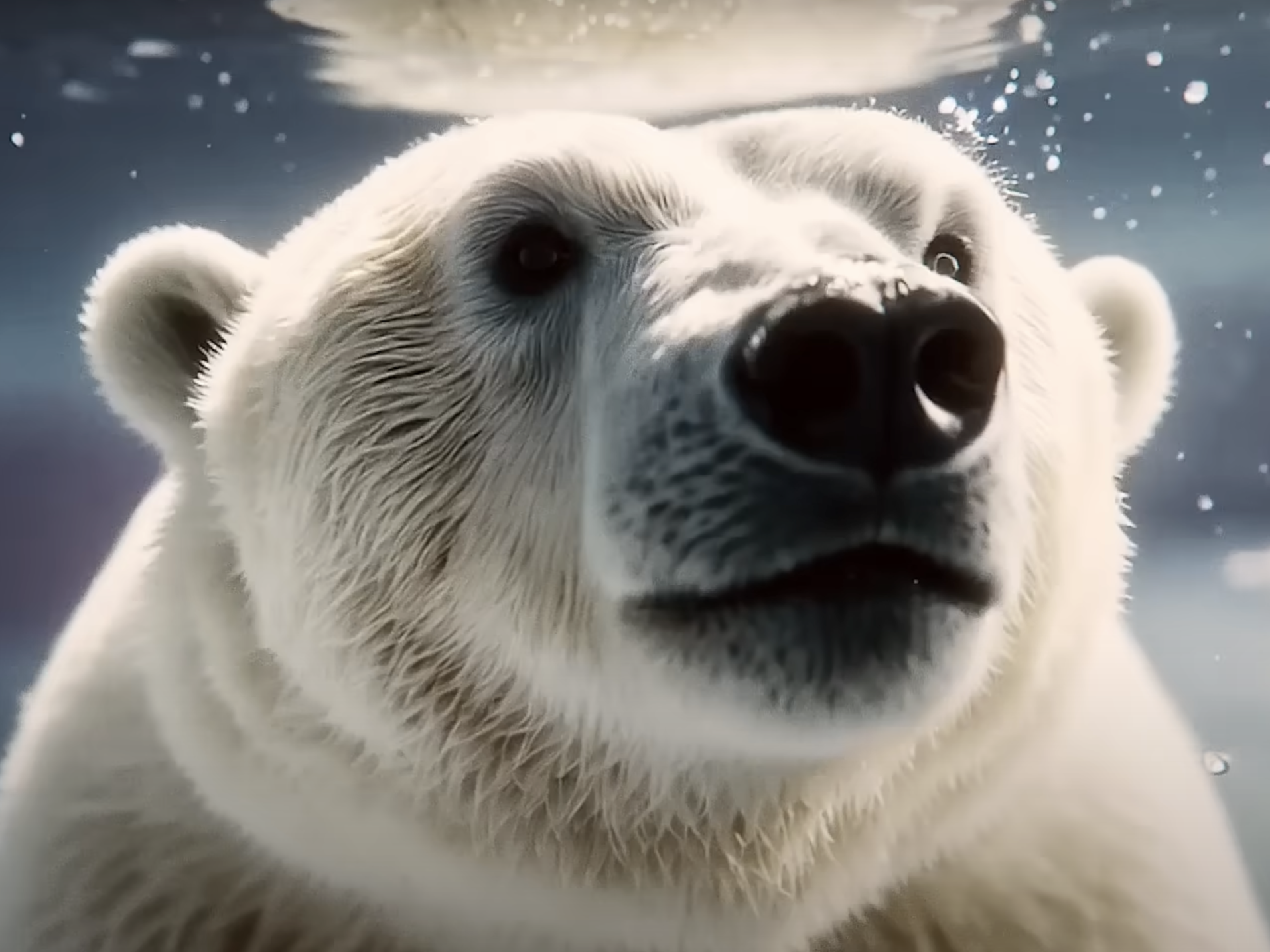
Real Magic AI
Real Magic AI
Have you seen this Coca-Cola holiday TV spot? It's produced by their Real Magic AI... and people have opinions about that.
-
Get a free jar of Jif!
Get a free jar of Jif!
Check out this very silly promotion from Jif Canada. So silly it's good?

-
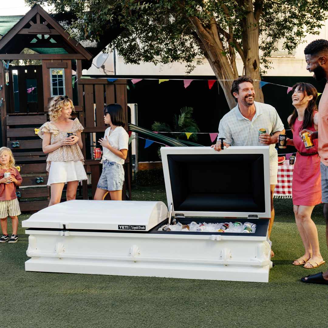
Liquid Death x YETI
Liquid Death x YETI
Pretty awesome brand collaboration. Liquid Death is auctioning off this YETI cooler (and the bids are crazy)!
-
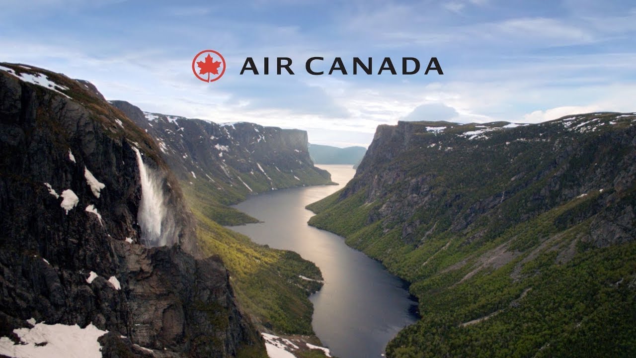
Air Canada Safety Video
Air Canada Safety Video
We've all seen airlines try to be creative when producing an in-flight safety video, but I think Air Canada does it best.
-
AJ Capital Partners Website
AJ Capital Partners Website
Loving the mobile experience and the animations on this website. Pretty cool that you can change to High Contrast at the bottom for better accessibility.

-
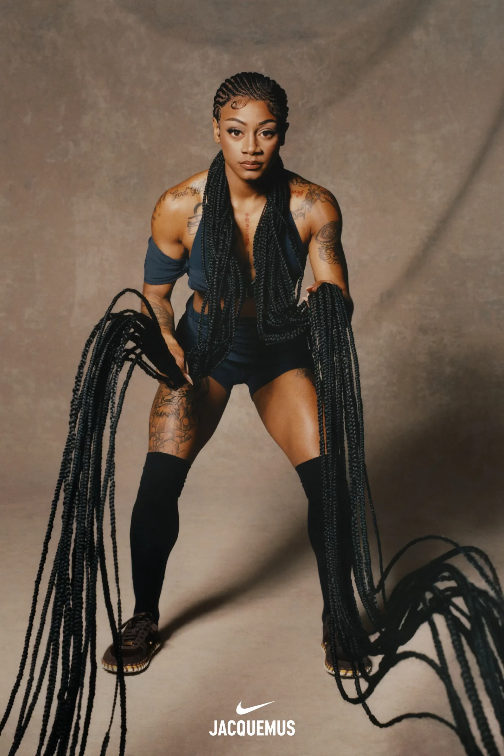
Sha’Carri Richardson for Nike x Jacquemus
Sha’Carri Richardson for Nike x Jacquemus
Awesome video concept from Nike. Champion runner Sha-Carri Richardson swinging her trademark braids like battle ropes.
-
The Social Media Consumer Report | Hootsuite
The Social Media Consumer Report | Hootsuite
A definitive look at why people follow, engage, buy, and break up with brands on social media.

-
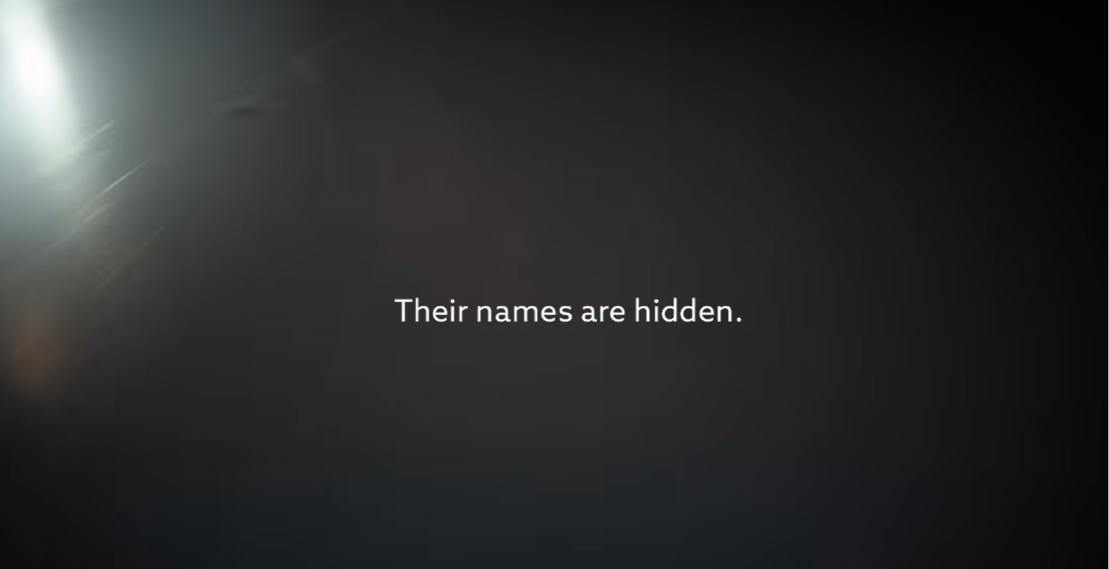
Molson Canadian – See Her Name
Molson Canadian – See Her Name
For International Women's Day, Molson Canadian partnered with the PWHL to move their name up on their jersey and the players' names down due to their names usually being covered by their ponytails. "[Molson] covered their names so hers can be seen."
-
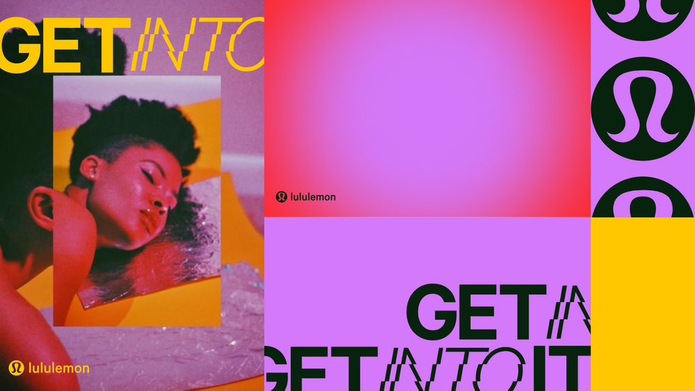
Lululemon — “Get Into It”
Lululemon — “Get Into It”
Noticed this campaign from Lululemon over the weekend and enjoyed the versatility of the tagline "Get Into It." The video and design elements are clearly targeting Gen-Z buyers (nothing we haven't seen before), but I think the tagline's layered meaning perfectly captures the spirit of the brand/campaign.
-
Pinterest Predicts | 2024 Trend Report
Pinterest Predicts | 2024 Trend Report
Pinterest predicts trends for 2024, including eclectic grandpa, rest stops, aquatecture and more.

-
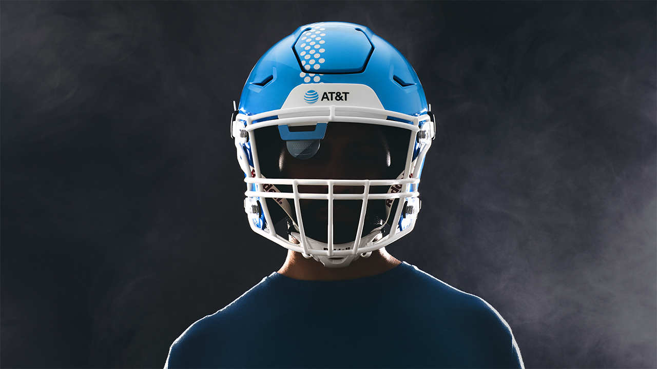
AT&T Helmet
AT&T Helmet
If you were invested in college bowl game season, you've probably seen this spot. Well done on so many levels.
-
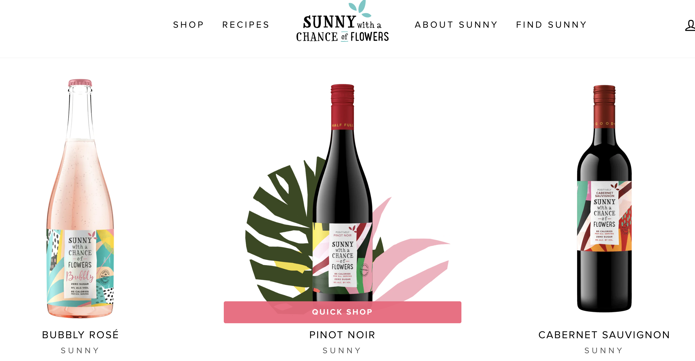
Cool Animations – Sunny with a Chance of Flowers
Cool Animations – Sunny with a Chance of Flowers
One of our clients shared this as inspiration. Some pretty cool animations, especially the wine pouring on the product pages.
-
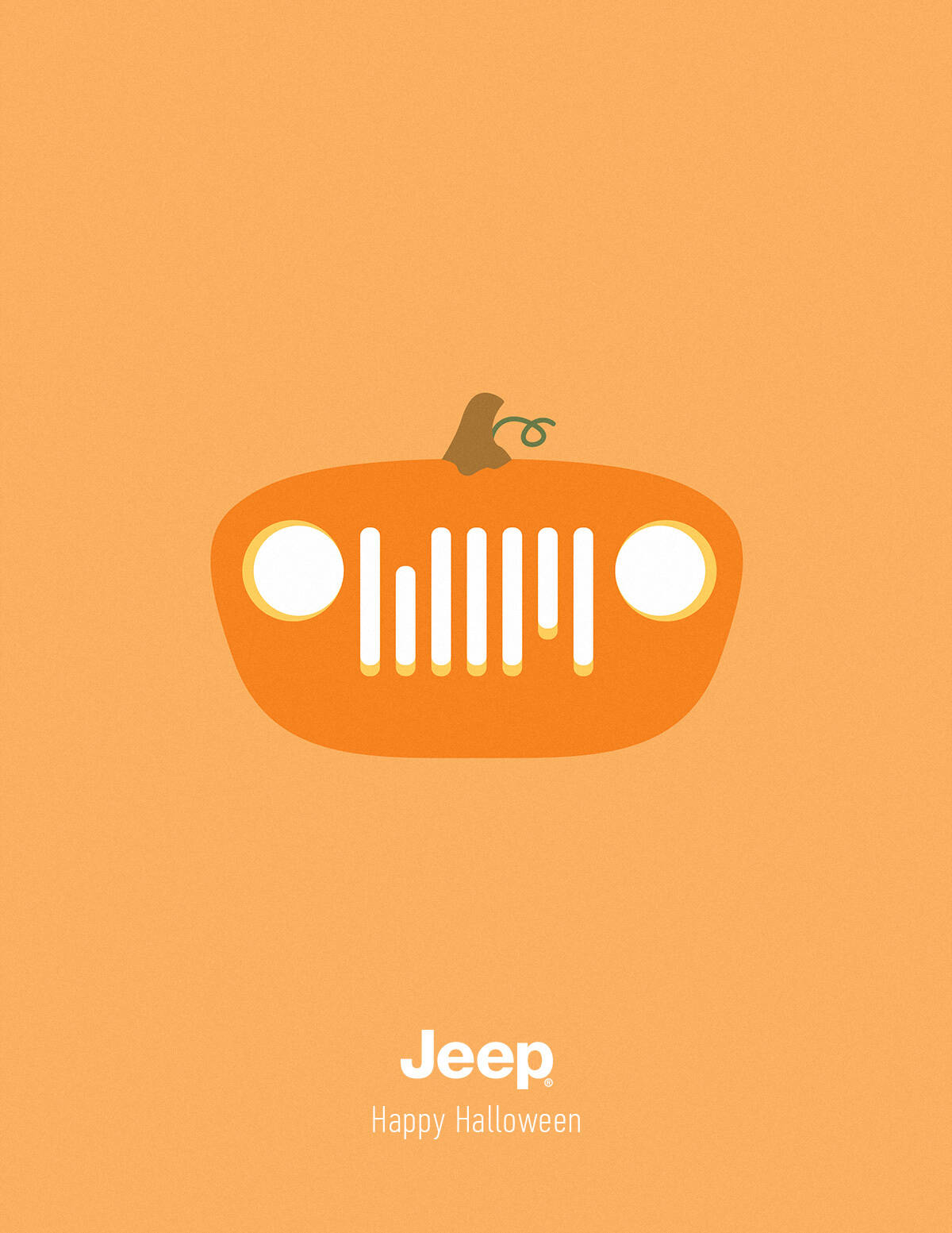
Happy Halloween!
Happy Halloween!
Some Halloween-themed ads for the occasion! Check them out.
-
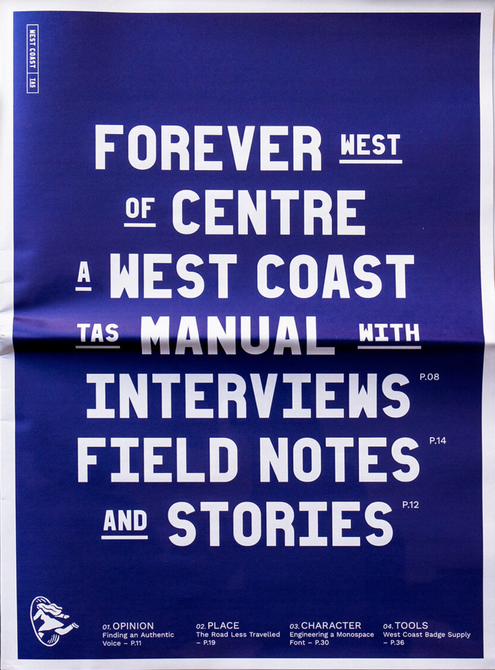
Place Branding
Place Branding
One of the many highlights from the Brand New Conference last week. Heard from an agency that prioritizes "place branding," or branding for communities, states, countries, etc. In particular, their work for Tasmania is really powerful. Incredible brand system that has been embraced by community members and video work that emphasizes the diversity of the land and people.
-
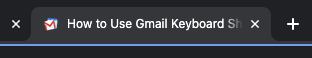
VisibilityChange for the “Win”
VisibilityChange for the “Win”
I have no idea who "Boxysuite" is, but I felt like I needed to share. This post is not about the design of the page/post, although there is something to learn from its simplicity. This is not about the content on the page, although again some of you may learn something about shortcuts in Gmail that could be cool. This post is about what happens to the tab when you leave it (do not close) and go to a different tab. This has been around for a while, but its rarely used. Could be an opportunity here. ... Oh yeah, make sure you hit the "view source" to see the page. (I often forget that.)
-
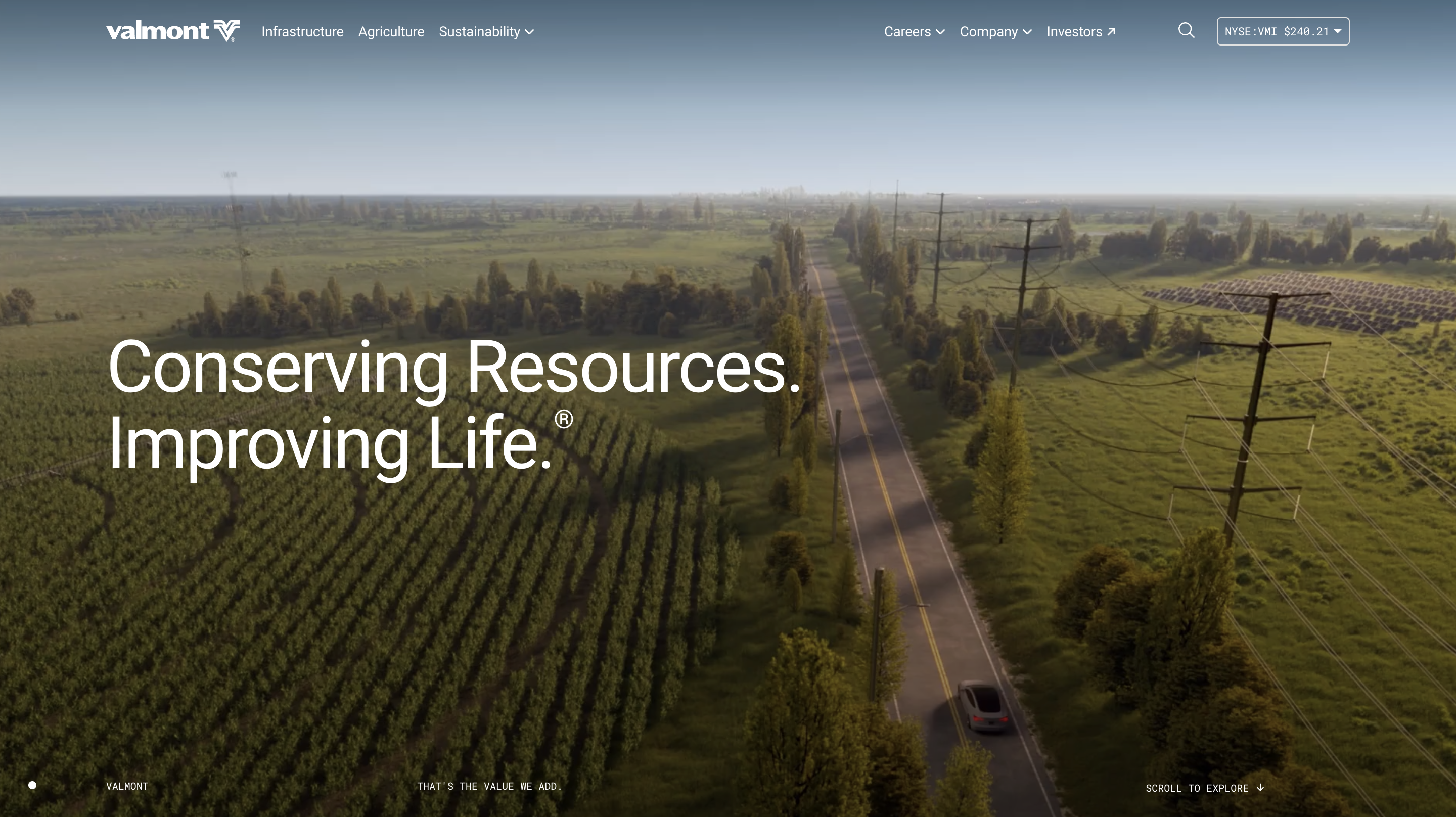
Valmont
Valmont
Valmont is an industrial Machinery Manufacturing company. Their website incorporates many cool motion elements that are worth checking out!
-
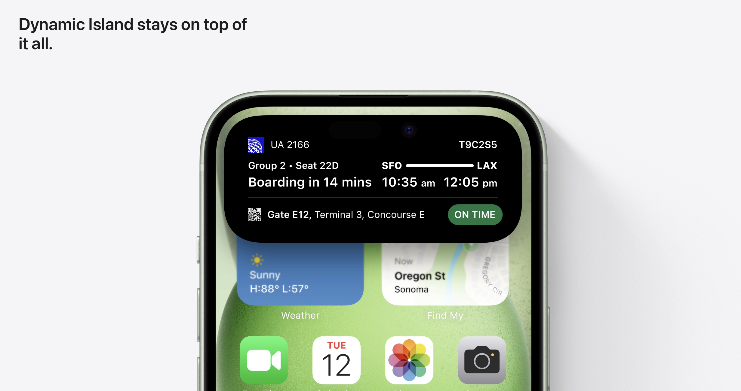
New Apple launch means new content.
New Apple launch means new content.
The new iPhone and Apple Watch launched today. Check out the new landing pages for some clever headline-driven content. On the iPhone page, there's a fun new animation at the bottom of each module that reveals additional information or indicates a carousel of content.
-
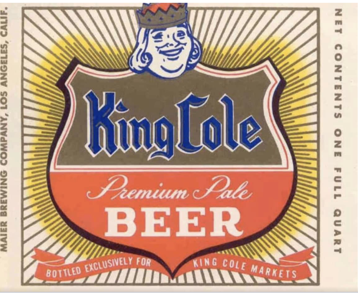
Nostalgic Beer Label
Nostalgic Beer Label
Found this cool old beer label from the 1960s. It's from a now-defunct (closed in the late '80s) indie grocery store in Whittier, a suburb of Los Angeles. I used to go there with my grandma when I was a kid. Thought this was a fun retro share.
* There was a King Cole Foods in Detroit, but I don't think it's connected.
The link below is from an essay mentions the market.
-
Greenix Pest Control
Greenix Pest Control
Stumbled upon this while trying to find someone to get rid of a wasps nest. Super fun copy for a not so exciting brand. Wasps. Ruining BBQs since the dawn of time. Ants. One by one they'll drive you up the wall. Spiders. The literal stuff of nightmares.

-
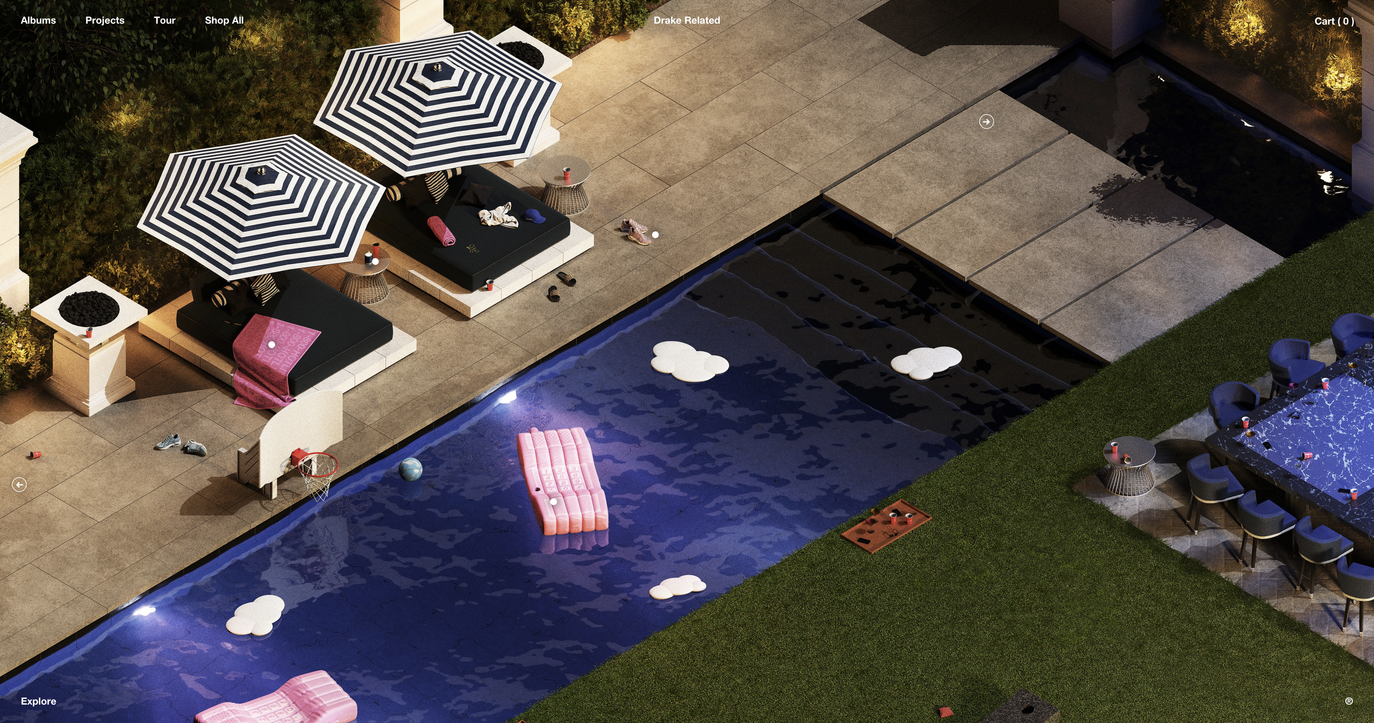
Drake Related
Drake Related
Drake recently revamped his online store, and it's a pretty immersive experience. Fun to explore his house while exploring (incredibly overpriced) products.
-
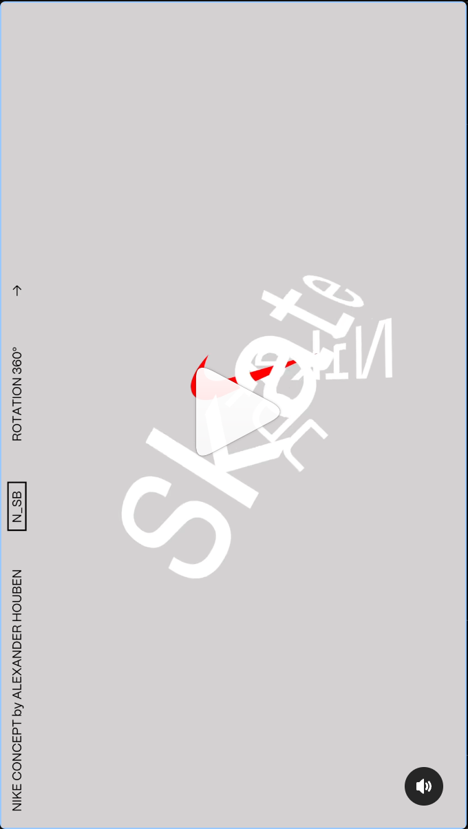
Nike Concept
Nike Concept
Check out the rest of this artist's work. His motion typography is next level.
-
Nike Streakfly
Nike Streakfly
This creative studio in London was asked by Nike to create an animated metaphor for the ultra-light, ultra-quick Nike Streakfly. Once you see it, you can't unsee it!

-
Truth Microsite — A Breath of Stress Air
Truth Microsite — A Breath of Stress Air
Check out this microsite from Truth. Cool visual elements, great CTAs, and the "caught in a stress loop" line will make sense as you keep scrolling!

-
Progressive TV Dad Commercials
Progressive TV Dad Commercials
I love these Progressive "TV Dad" commercials. The writing is so funny, and it uses nostalgia in the best way.
-
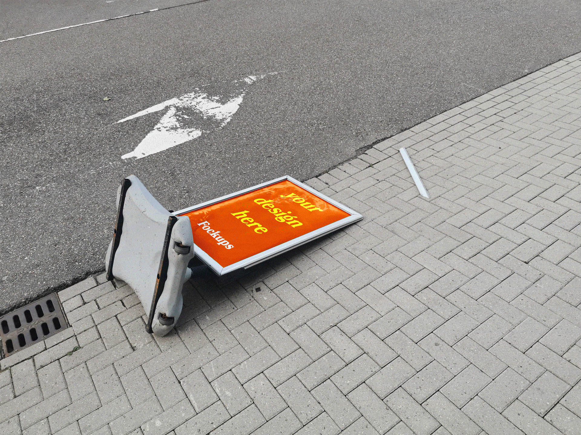
Not your average mockup.
Not your average mockup.
Creative work doesn't always look perfect in the real world. It probably isn't smart to use this tool in a client presentation, but enjoy a fun dose of reality!
-
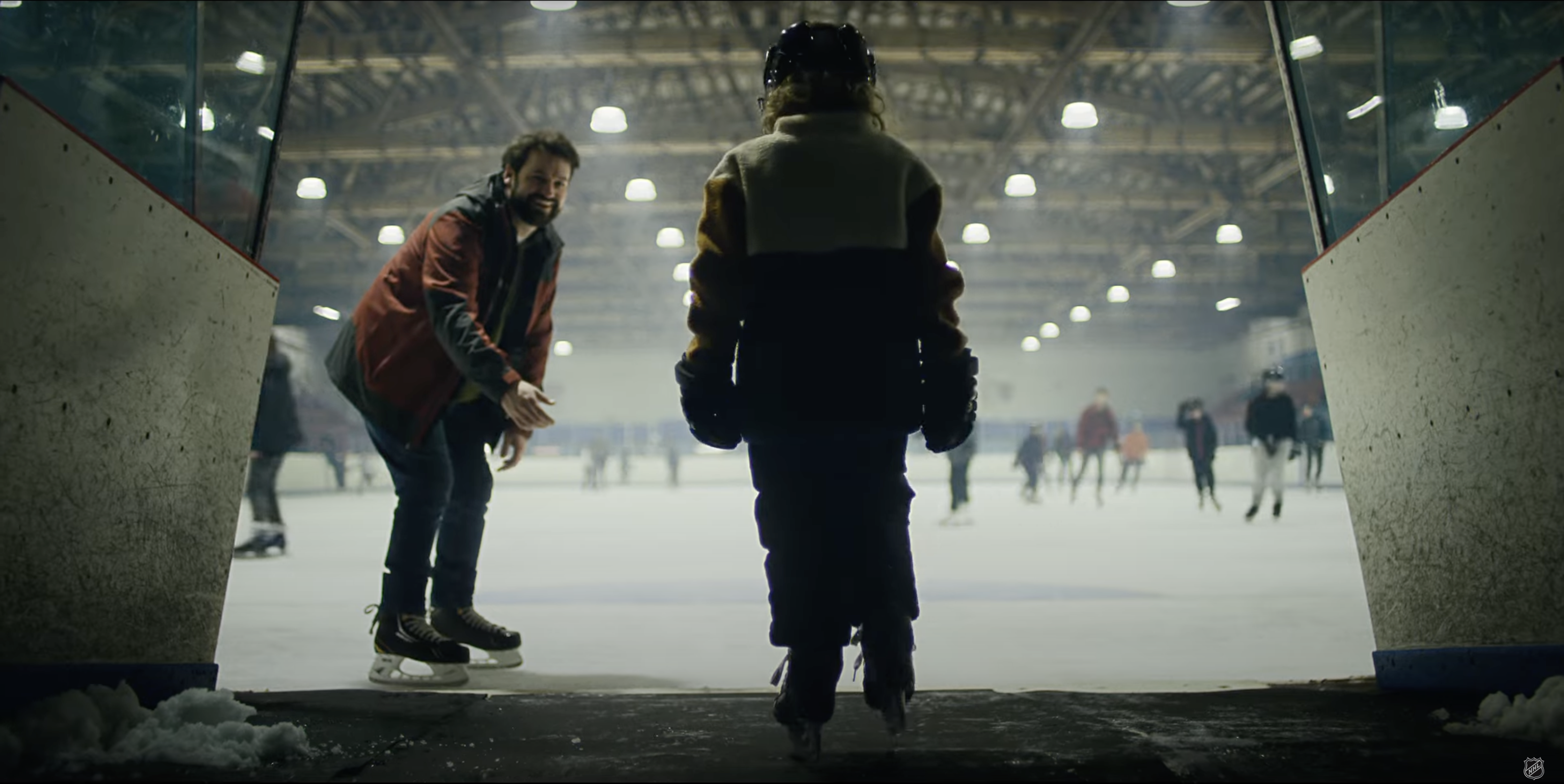
NHL — “Look Up”
NHL — “Look Up”
You've probably seen this spot if you're watching the Stanley Cup Playoffs. Great writing and storytelling that doesn't feel forced. Similar to the Dick's Sporting Goods work that Jim presented a few weeks back.
-
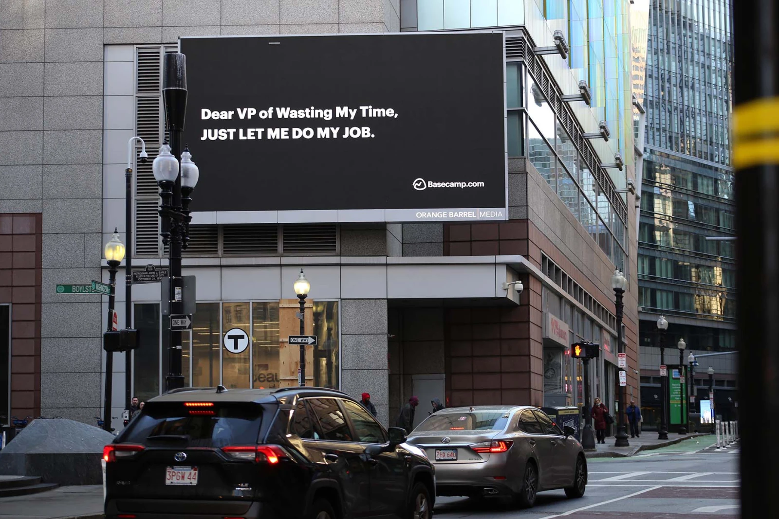
Basecamp: Just Let Me Do My Job
Basecamp: Just Let Me Do My Job
A little fun for the PM team! Basecamp (sorry Asana) launched a new, fun campaign where the TV spots take you back in time reminding us that there's a better way to get things done and that it doesn't have to be crazy at work.
-
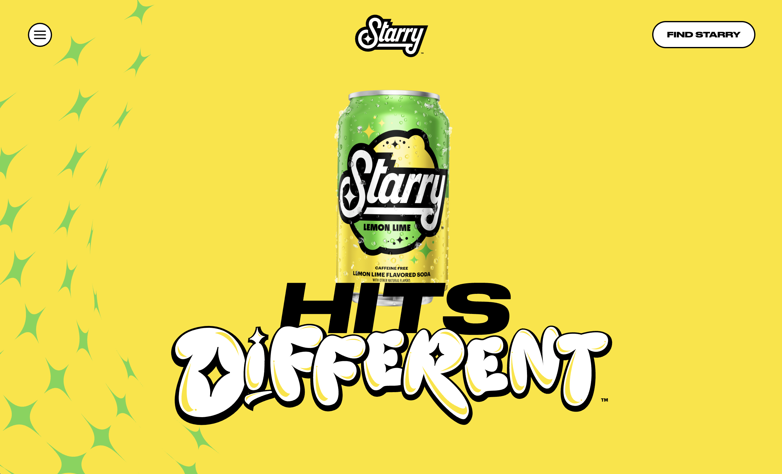
Starry — Sierra Mist’s rebrand “Hits Different”
Starry — Sierra Mist’s rebrand “Hits Different”
Sierra Mist has been replaced by Starry, and their brand visuals and messaging are targeting a much younger audience. Their microsite is a pretty cool example of creating an experience surrounding a product without a ton of content, and the younger generation in mind. Some of the site behaviors are really unique and directly influenced by digital behaviors of Gen Z (shout out the infinite scroll landing page).
-
Crown Royal Apple
Crown Royal Apple
I might be late to the game, but I recently noticed Crown Royal Apple's super cool visual approach. Check out their latest TV spot.
-
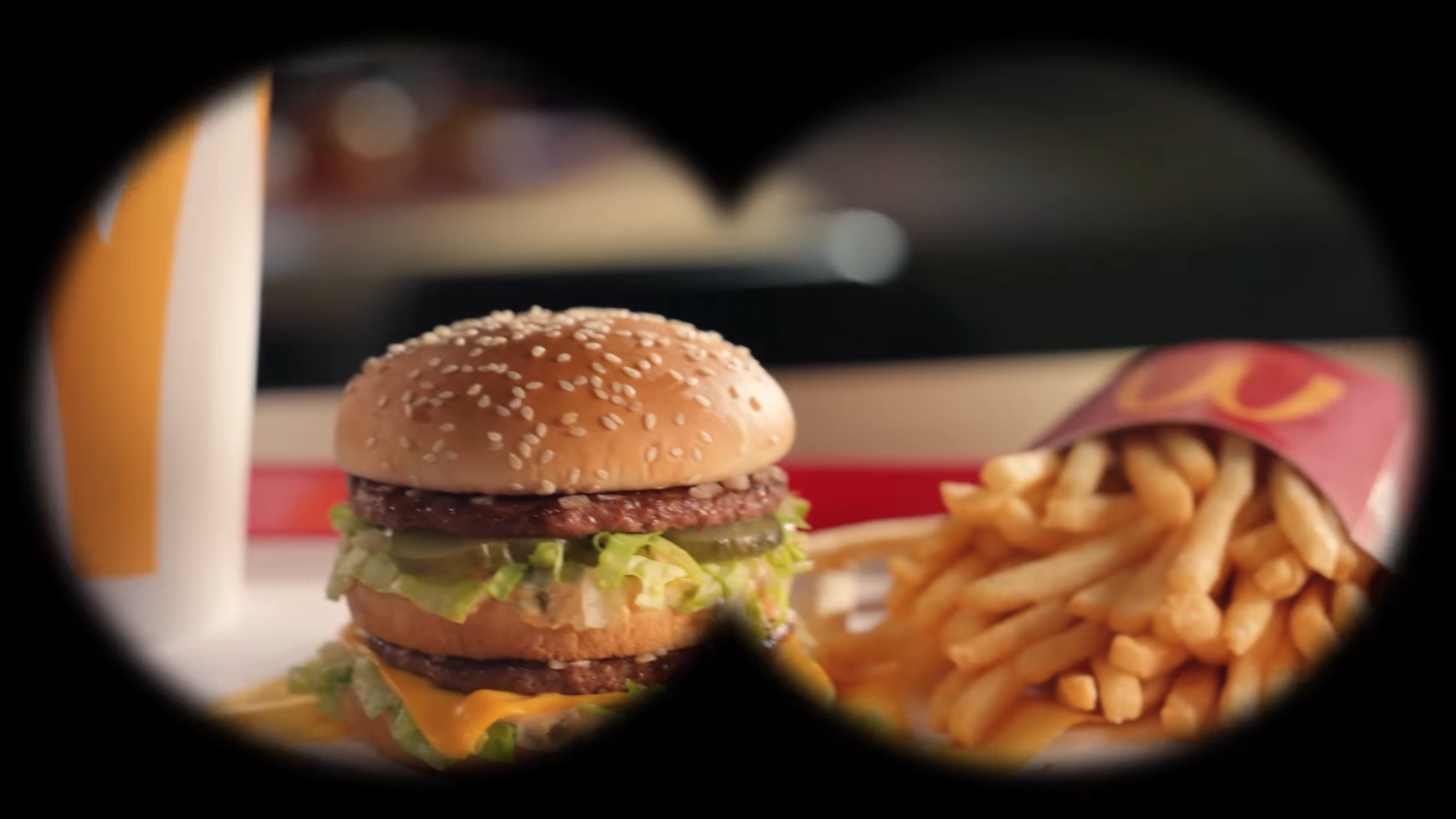
“Heist” | McDonalds
“Heist” | McDonalds
An old friend is back to let the world know that McDonalds is improving their burgers.. check out their latest TV spot by following the link in the top right.
-
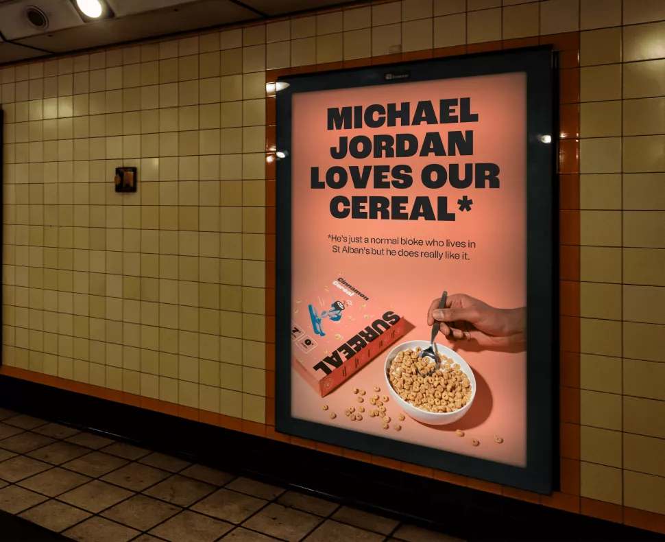
Surreal Cereal Endorsements
Surreal Cereal Endorsements
Surreal, a UK cereal brand, has tapped endorsements from normal people with not-so-normal names as the stars of their latest ad campaign.
-
Nordstrom Rack rebrand
Nordstrom Rack rebrand
Nordstrom Rack just rebranded. The new visual system is cool, but it's actually heavily inspired by their logo/brand from the 70s and 80s. Is the updated retro branding trend here to stay?

-
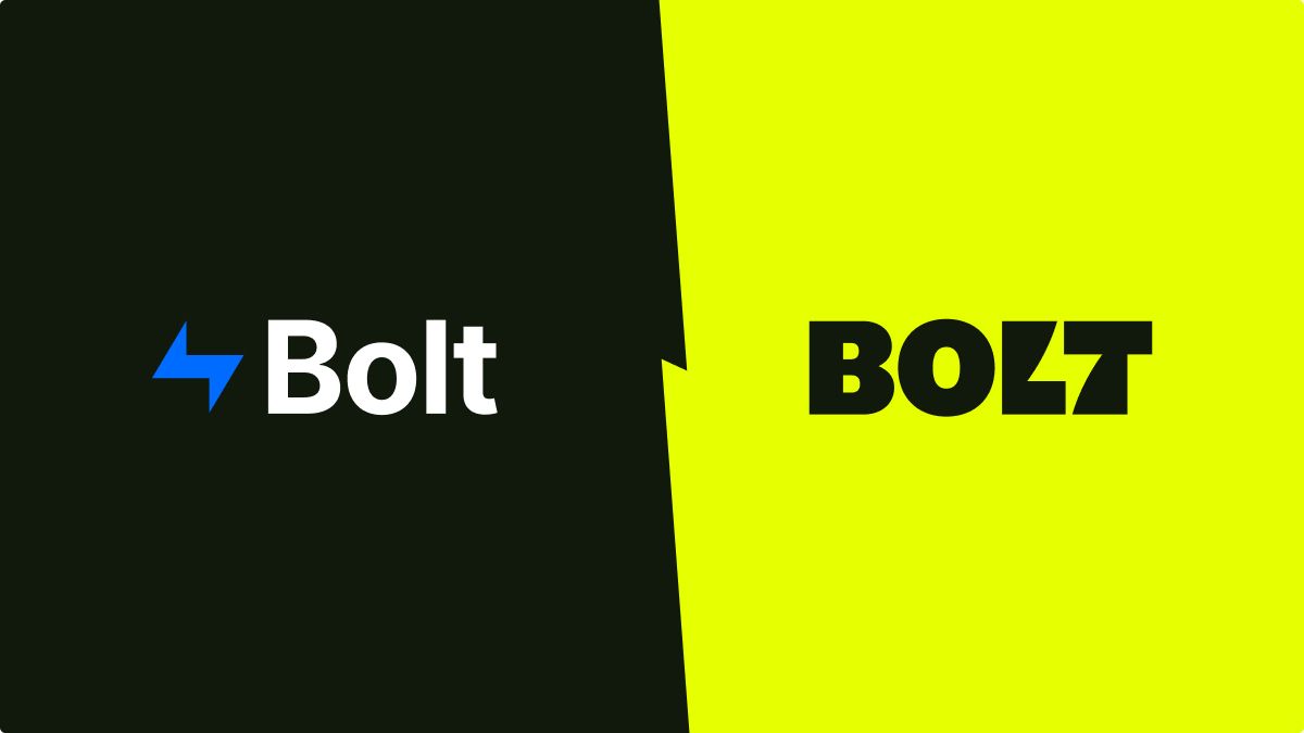
Bolt Rebrand
Bolt Rebrand
Check out this total brand overhaul for an e-commerce platform. A really bold system of brand elements!
-
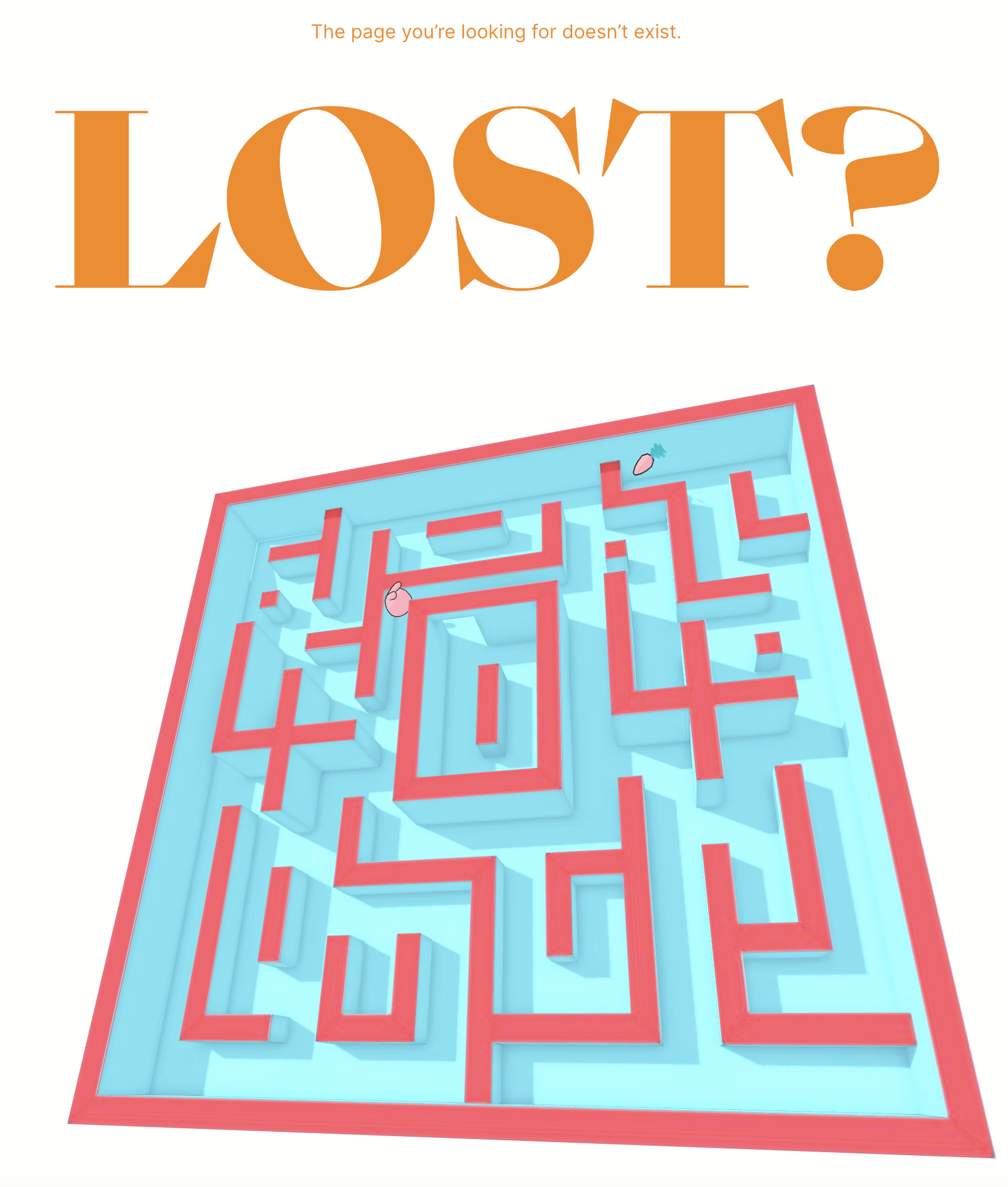
Epic 404 page!
Epic 404 page!
It's always fun to find a cool 404 page that feels like an Easter egg. This Belgian agency will keep you occupied even when a link is broken! Check out more award-winning 404 pages at the link.
-
Chobanification. What is it?
Chobanification. What is it?
The semi-recent rebranding of Chobani's font was a big hit. But now it seems like every brand is using a similar font. Why?
-
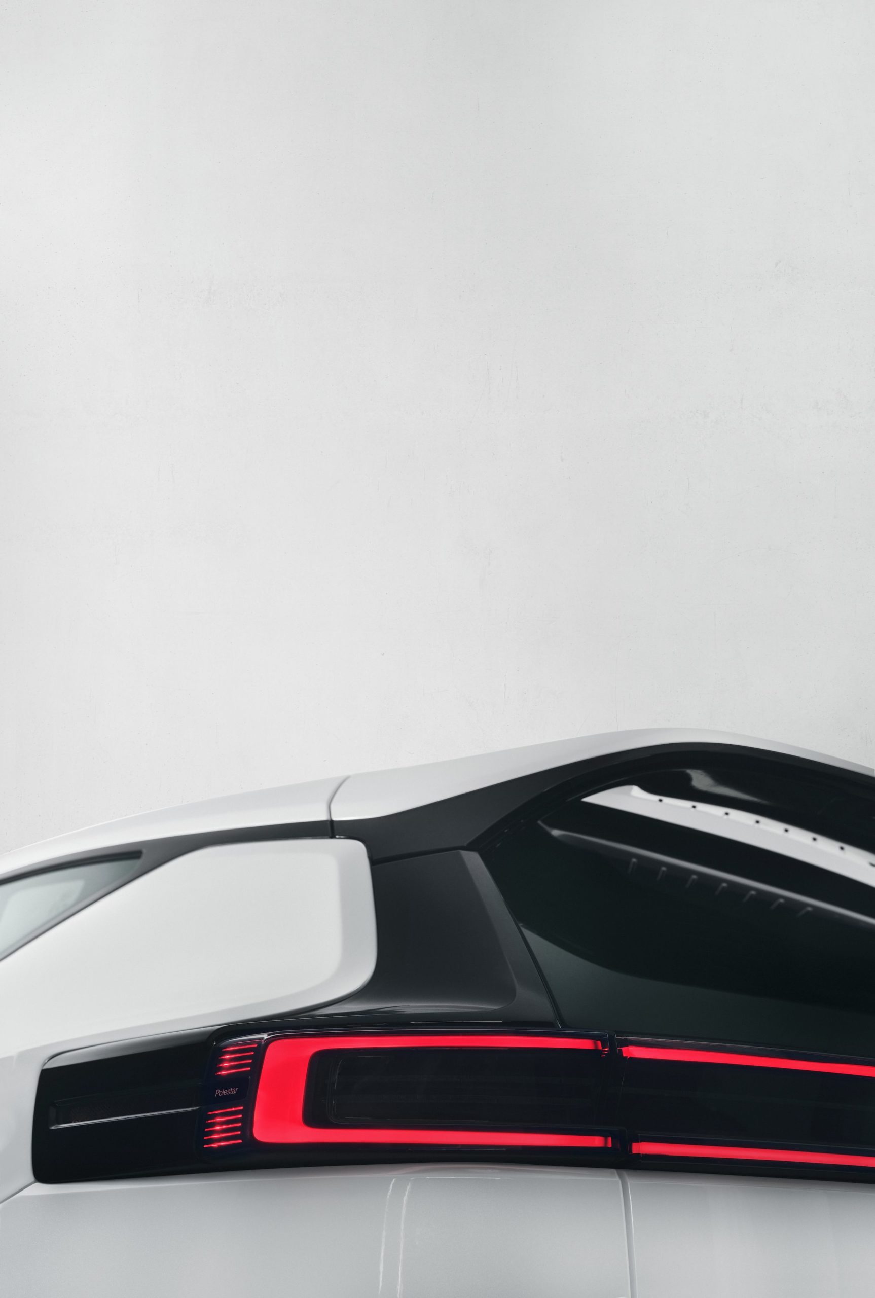
Polestar
Polestar
The Polestar website features interactive scrolling graphics, clean photography, and lots of room for copy to breathe.
-
This agency can solve anything.
This agency can solve anything.
How does Solve in Minneapolis promote the agency to the community? By creatively solving innocuous annoyances in the world.
-
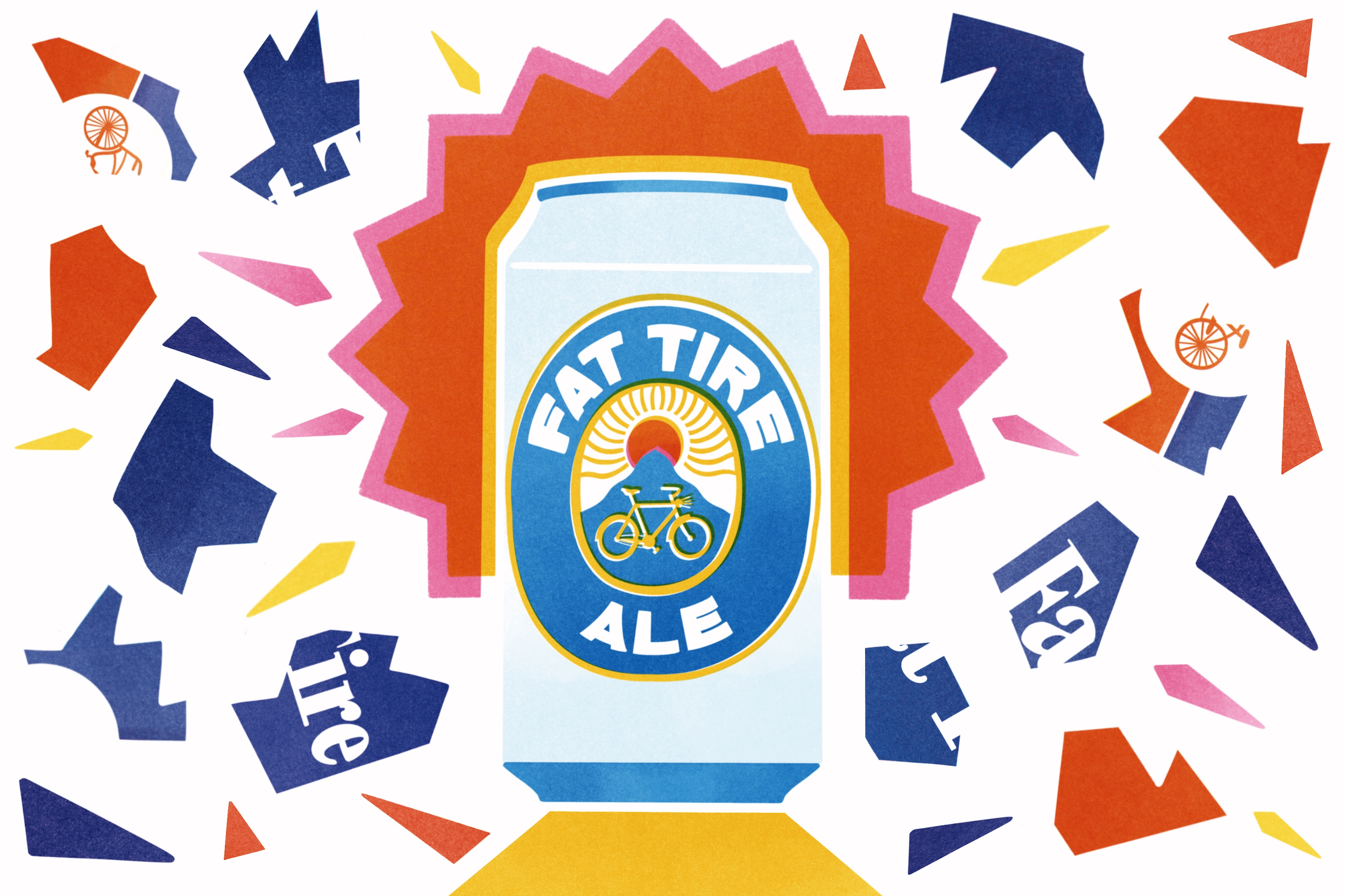
Fat Tire Beer Rebrand
Fat Tire Beer Rebrand
Fat Tire Beer recently rebranded — but the new look is about more than design. The rebrand also points to a growing appreciation for carbon-neutral or sustainable branding.
-
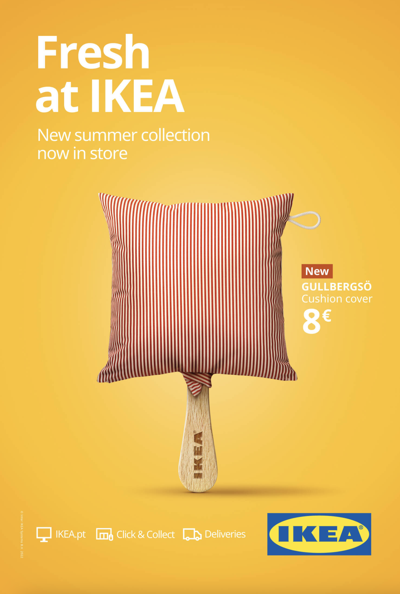
Fresh at IKEA.
Fresh at IKEA.
IKEA recently ran a series of print ads for their summer collection. Combined visuals work really well here.
-
Cool way to show product function through copy.
Cool way to show product function through copy.
Check out this VW print ad. Simple but effective copy technique.
-
The craziest portfolio ever.
The craziest portfolio ever.
Check out (or play on?) this web developer's portfolio. The details are truly endless — don't overlook that browser "icon." Incredible!
-
Knock Philsophies
Knock Philsophies
Last year, this agency in Minnesota celebrated the cultural differences on their team to create an interactive microsite that highlights their goals.
-
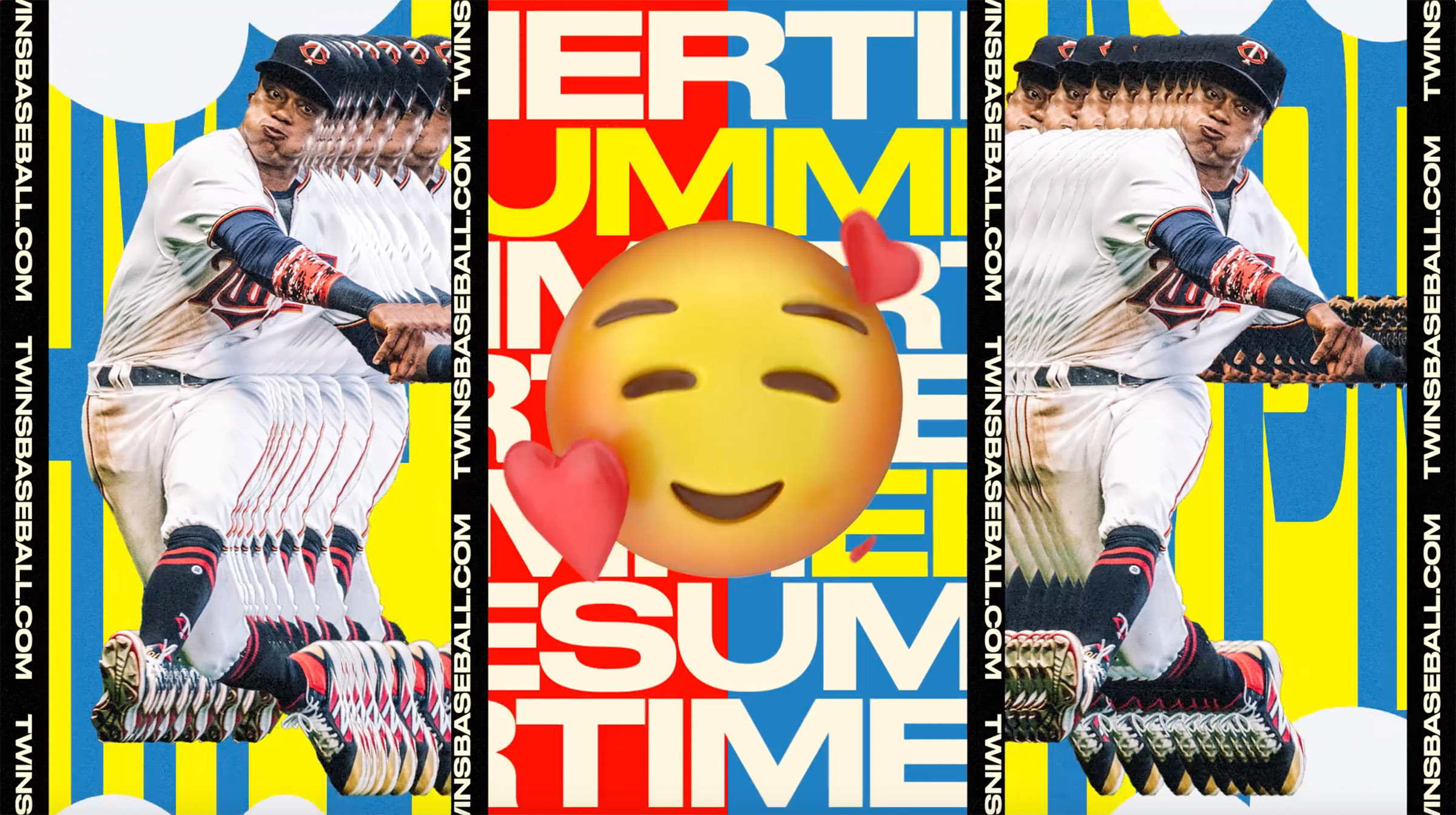
Minnesota Twins | 2019–20 Season
Minnesota Twins | 2019–20 Season
Probably the coolest sports rebrand I've seen. A totally new way to approach graphics, GIFs, signage, video, and more.
-
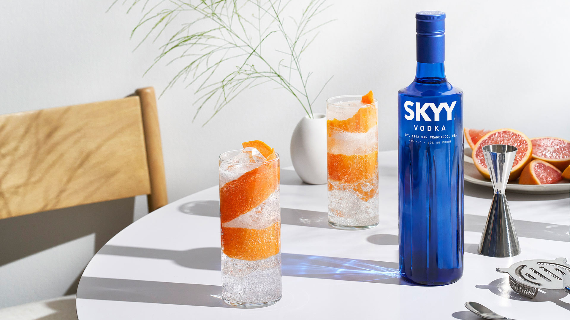
SKYY Vodka
SKYY Vodka
The new look of SKYY Vodka was created by MONO, an agency in Minneapolis. Their approach is very reminiscent of our brand panel process. Great photography and copy!
-
Contrast Grid
Contrast Grid
Test foreground and background color pairs for compliance with WCAG 2.1 minimum contrast guidelines.
For our purposes (targeting Level AA), color pairs must have a contrast ratio of at least 4.5 or, for large text (i.e. 18px and larger or bold 14px and larger), 3.0.
-
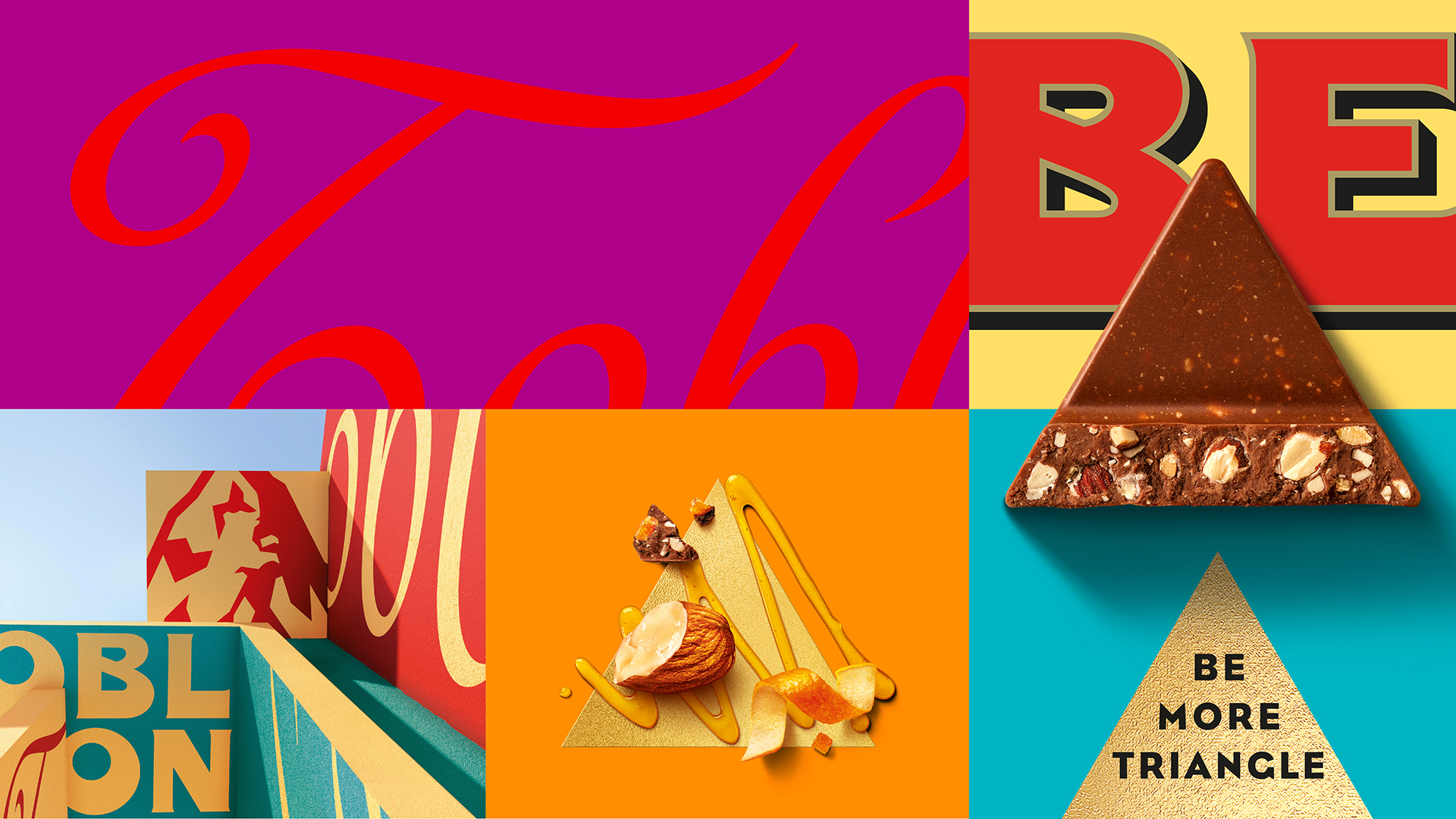
Toblerone Rebrand
Toblerone Rebrand
When Mondelez, the parent company of the iconic chocolate bar, moved production from Switzerland to Slovakia, Toberlerone was required by Swiss law to rebrand. Switzerland actually has strict laws against the use of national symbols on brand packaging (i.e. the Matterhorn Mountain), and these symbols can only be used by Swiss companies. So now it's time to "be more triangle."
-
MONO Internship Bot
MONO Internship Bot
The MONO Internship Bot uses AI to power a unique experience for applicants.
-
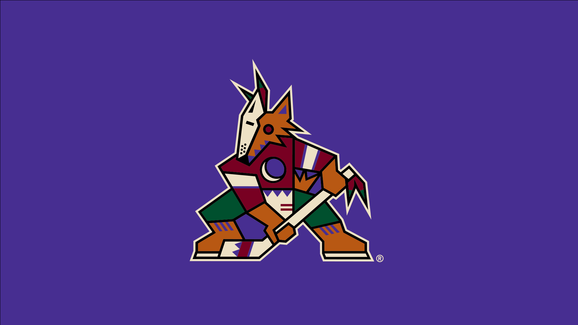
Arizona Coyotes “Rebrand”
Arizona Coyotes “Rebrand”
Last year, the Arizona Coyotes rebranded their identity — and their purpose — as a hockey team. The "new" logo is actually their old logo from the '90s! Check out the GIF for a cool logo breakdown.
-
The Whole Brand Project from Barkley
The Whole Brand Project from Barkley
What is a Whole Brand? Barkley, an agency in Kansas City, has a cool research arm similar to our very own TBD.
-
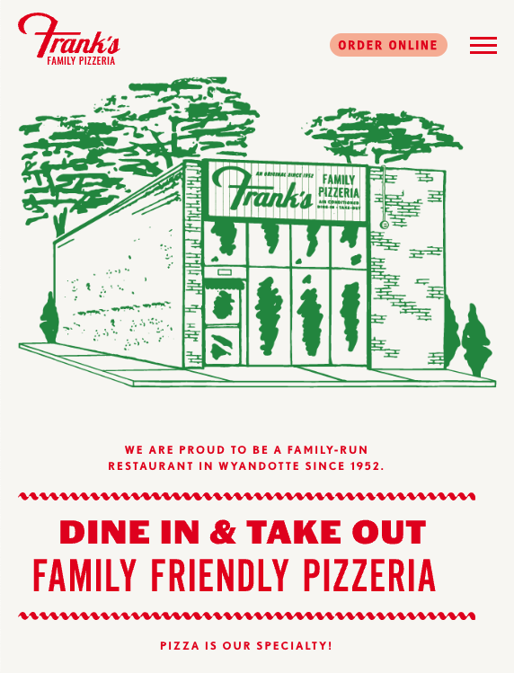
Frank’s Pizza Website / Branding
Frank’s Pizza Website / Branding
Found this cute mom & pop pizzeria in our neighborhood and love their website! A great execution of adding some character and flare to their web presence...but their pizza recipe could use some work.
-
CodePen
CodePen
CodePen is an online community that allows you to write code in the browser and see the results of it as you build. They focus primarily on front-end languages like HTML, CSS, JavaScript, and preprocessing syntaxes that turn into those things.
It was founded in 2012 by full-stack developers Alex Vazquez and Tim Sabat and front-end designer Chris Coyier (the latter, the founder of CSS-Tricks).